So I noticed in my Facebook feed a lot of comments on a post that Netflix had made. Out of sheer curiosity, I began reading them, and out of sheer entertainment, felt compelled to make an infographic about them. So I did. Here it is. Click the image for a larger version.

Tag Archives: typography
He’s wildly talented and the fact that he’s so young makes me want to vomit with jealousy. I’ve been looking at his work a lot lately for inspiration. Not even particularly with any project, just inspiration for life, his stuff is that good. Those muted colors and grainy textures and simple typography and geometric forms….yum.
Netflix infographic
2 JunMatthew Lyons is awesome (and I’m jealous)
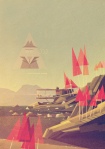
7 MarSo recently I stumbled upon (literally) the work of Matthew Lyons, a 22 year old illustrator from Britain. His work is simply gorgeous. He has a geometric, early 20th century Modernist style that is just wonderful when paired with his use of texture and typography. His series “Locations” particularly resonated with me:


He’s wildly talented and the fact that he’s so young makes me want to vomit with jealousy. I’ve been looking at his work a lot lately for inspiration. Not even particularly with any project, just inspiration for life, his stuff is that good. Those muted colors and grainy textures and simple typography and geometric forms….yum.
Weightlessness
16 FebToday I installed my most recent work in the Apothecary (a student-run gallery at UTC). The theme of the show is Weightlessness. If you know me, you know I’m a bit of a nerd for sci-fi. Lately, I’ve been all up in some BSG. I’m finishing up my GenEd with an Astronomy class this semester, which is proving to be equal parts challenging and interesting. Given all of this, it just made sense that my work would be deep space oriented.
For my work, I began researching communications logs for NASA Gemini and Apollo missions. They are available for free download at the NASA website. They’re gorgeous on their own merit; they’re scans of typewriter-written transcripts of ground-to-air communications.

I read through one of the transcripts from the Apollo 13 mission, and found myself mesmerized by it. I expected to find a log riddled with jargon I didn’t know, but instead what I read was incredibly human. It gave me chills at times to read their conversations. This particular transcript did not contain the infamous Apollo 13 disaster, but instead was a log of their initial take-off and first day in orbit. The whole log was full of wonderful snippets, but found a particularly interesting bit of dialogue between Commander (CDR) James A. (Jim) Lovell, Jr., Command Module Pilot (CMP) John L. (Jack) Swigert, Jr., and Lunar Module Pilot (LMP) Fred W. Haise, Jr.

This really struck something within me; it read almost like poetry. The best I can figure from the log is that ORDEAL had something to do with the camera they were trying to mount. As you can imagine, trying to Google search “Apollo 13 ORDEAL” only returns a lot of Tom Hanks.

Anyway, I knew that the line “your blood rushes to your head because your heart doesn’t have anything to pump against” was something I definitely wanted to work with.
I came across the work of Antoine de Villiers, a very talented figure painter. He recently created a short series of beautiful paintings called “Weightless.” I chose one of his paintings and abstracted the form, removing certain parts, adding others and vectorizing it in Illustrator. I then found some license-free deep space images on Wikimedia Commons of the Crab Nebula and the Omega Nebula. I chose to use Archer as my typeface because its hairline weight is one of my favorite things. Ever. The type is so thin and, well, weightless, that from a distance you only get a hint that something is there, and are quietly asked to move in closer to engage with the piece and read its message. The final printed piece is 19×15 inches, so the type is legible upon close inspection, which is exactly what I wanted to achieve.

The whole composition came together quite nicely, I must say. The show opens tomorrow, February 17th at 5:30 pm at the Apothecary, 744 McCallie Avenue, Suite 113 The Doctor’s Building Chattanooga, TN 37403. Feel free to come by and check out not only my work, but the excellent work of my classmates, designers, photographers and painters alike.
Feel Better: A packaging project
13 FebMy allergies keep me sick throughout the year. On average, I find myself in the cold medicine isle of the drug store three to four times a year, bleary-eyed and sniffly, trying to find the right medicine. I am immediately assaulted by harsh geometry and cold, unfeeling or just plain cluttered design like this.


I feel terrible, and all I want is to feel better. I want something that is going to feel like a warm bowl of soup, a cozy blanket and my mom stroking my hair. I want something comforting, and cold medicine packaging is anything but. This is the challenge I decided to take on: make cold medicine look as good as it’s going to make the user feel.

I wanted to create something novel and unexpected. Given the fast approaching deadline, I knew my limitations; I had to go with something I already knew how to do. Thankfully, I learned how to knit in high school, and what’s more comforting than a knit sweater? It was a solid concept; all I had to do was learn to knit pouches and I was set. After some internet research, I quickly learned and applied the technique.

Deciding on the typography was fairly easy, but typesetting the Drug Facts proved to be rather difficult. I wanted the look and feel to be simple, but there is a lot of information that is legally required to be on medicine packaging. But, this is why I love design: there are certain rules and challenges you have to figure out how to work around. All in all, I feel very proud of my work, even though these are all just mock-ups, and I hope to push the concept even further and really develop these into something fantastic.


