Playing catch-up

18 Apr

A lot has happened since I last posted!

I’ll make this a quick post, since I have a lot of new work to show.

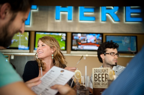
Let’s begin with the work I did for Blue Plate this past summer. The local restaurant The Blue Plate opened a new bar, Local 191. While I was working at Widgets & Stone, I was able to create some collateral for this new bar.

I was also able to design a cycling jersey for Bell Lumber & Pole Co.

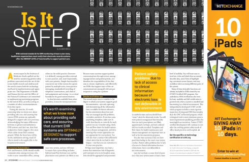
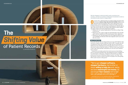
I have learned a great deal since I last posted. I worked at True North Custom Media, a great custom publishing company here in Chattanooga. I was the sole designer for HIT Exchange, a magazine about healthcare technology. I was responsible for designing the print, digital and tablet editions of each bimonthly issue. My favorite part of this job was developing the articles for the iPad. I loved animating the artwork and making the graphics interactive. I learned a great deal about developing for the tablet format. We used Adobe Digital Publishing Suite, which is the same system that large magazines like Martha Stewart Living uses. Here is a selection of my print work from the magazine:

If you’d like to see the work I did for the iPad, download the free HIT Exchange app from the iTunes Store.

Netflix infographic

2 Jun

So I noticed in my Facebook feed a lot of comments on a post that Netflix had made. Out of sheer curiosity, I began reading them, and out of sheer entertainment, felt compelled to make an infographic about them. So I did. Here it is. Click the image for a larger version.

More geometry deliciousness

6 Apr

I’ve been working on a few major projects right now with long turn-around times, and don’t want to post on them until they are finished. This is why lately my posts have been inspiration-based. Soon my projects will be done and I will post on them. But until then… Okay, enough explaining myself.

Here are some simply gorgeous aerial shots of landscapes formed by agriculture into geometric beauty, photographed by satellites orbiting the planet and even astronauts at the International Space Station. The colors, the textures, the topography, the geometry, it’s all just so beautiful.

Finney County, southwest Kansas

the Gezira irrigation fields in Al Jazirah, Sudan, one of the largest irrigation systems in the world

the green of fields surrounding the Nile as it passes Luxor

salt ponds in Nueva Victoria, Chile, at the heart of the Atacama Desert

where rainforest used to abound near Sao Paolo

Kansas, US

Games invading your life

8 Mar

Okay, I know I just posted yesterday, and I generally try to space these out, but I just saw this video and had to share. It’s Jesse Schell, a professor at Carnegie Melon talking about how gaming has begun to creep into reality in some really incredible and psychological ways. As a game designer, he wraps the presentation in the question, “imagine how great this will be when it’s designed!” Watch it through until the end, the second half is the best part.

Embeding SWF in WordPress is a pain, so I’m sorry, but I’m going to need to just link it instead.

He begins with some small, clever possibilities, and increasingly explores more and more incredible implications of how game-thinking can change social, educational and economical behavior. It’s really incredible to think about, albeit a little spooky.

Matthew Lyons is awesome (and I’m jealous)

7 Mar

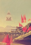
So recently I stumbled upon (literally) the work of Matthew Lyons, a 22 year old illustrator from Britain. His work is simply gorgeous. He has a geometric, early 20th century Modernist style that is just wonderful when paired with his use of texture and typography. His series “Locations” particularly resonated with me:


He’s wildly talented and the fact that he’s so young makes me want to vomit with jealousy. I’ve been looking at his work a lot lately for inspiration. Not even particularly with any project, just inspiration for life, his stuff is that good. Those muted colors and grainy textures and simple typography and geometric forms….yum.

Fractalicious

25 Feb

So I’m really bad at math. I know a lot of people say that, but really, it would anger you how bad I am. I once tried to add 3 to 19, and somehow came out with 12. Really. Bad.

That having been said, there are some things in the mathematical world that I find simply fascinating. Like sacred geometry. YUM. I mean, I can understand visually how the golden spiral relates to the Fibonacci sequence,

but when I look at it expressed like this…

HA! What does that even mean?

But I love the visuals that math creates. I love seeing something beautiful come from a strict set of patterns and rules. And I’m mildly obsessed with fractals.

Benoit Mandelbrot, the French-American mathematician hailed as the father of fractal geometry defines fractals as “a rough or fragmented geometric shape that can be split into parts, each of which is (at least approximately) a reduced-size copy of the whole, a property called self-similarity.” Basically, a strict mathematical pattern that repeats itself into infinity by exponentially getting smaller. You’re probably more familiar with fractals than you think. Ever played Legend of Zelda? The triforce is just the beginnings of the Sierpinski Triangle.

Boom. Fractal.

No doubt the most famous fractal is the Mandelbrot set, named after the aforementioned father of fractal geometry, the late Benoit Mandelbrot.

The Mandelbrot Set is generated from the formula, z=z^2+c. I have no idea why.

Here’s a short video on the Mandelbrot Set that explains quite succinctly what appeals to me about fractals:

A form in which the boundaries of that form contain miniature copies of the entire set, and within that endless unique shapes. Strikingly similar yet mathematically unique shapes from the same formula repeating into infinity. There’s something just so elegant and somewhat tragic about that thought. I’ve decided that fractals are a beautiful way to wrap my senior thesis in the proper language. I’ll be posting more on my thesis as it develops, but for now, enjoy this TED talk from mathematician Ron Eglash on fractals that occur in African villages. If you don’t have time to watch the whole thing (which is fascinating), at least watch the first three minutes or so as they really delve into the beauty of fractals and how they occur over and over and over in the natural world.

Weightlessness

16 Feb

Today I installed my most recent work in the Apothecary (a student-run gallery at UTC). The theme of the show is Weightlessness. If you know me, you know I’m a bit of a nerd for sci-fi. Lately, I’ve been all up in some BSG. I’m finishing up my GenEd with an Astronomy class this semester, which is proving to be equal parts challenging and interesting. Given all of this, it just made sense that my work would be deep space oriented.

For my work, I began researching communications logs for NASA Gemini and Apollo missions. They are available for free download at the NASA website. They’re gorgeous on their own merit; they’re scans of typewriter-written transcripts of ground-to-air communications.

I read through one of the transcripts from the Apollo 13 mission, and found myself mesmerized by it. I expected to find a log riddled with jargon I didn’t know, but instead what I read was incredibly human. It gave me chills at times to read their conversations. This particular transcript did not contain the infamous Apollo 13 disaster, but instead was a log of their initial take-off and first day in orbit. The whole log was full of wonderful snippets, but found a particularly interesting bit of dialogue between Commander (CDR) James A. (Jim) Lovell, Jr., Command Module Pilot (CMP) John L. (Jack) Swigert, Jr., and Lunar Module Pilot (LMP) Fred W. Haise, Jr.

This really struck something within me; it read almost like poetry. The best I can figure from the log is that ORDEAL had something to do with the camera they were trying to mount. As you can imagine, trying to Google search “Apollo 13 ORDEAL” only returns a lot of Tom Hanks.

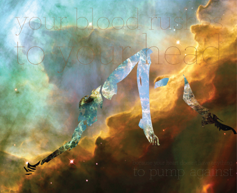
Anyway, I knew that the line “your blood rushes to your head because your heart doesn’t have anything to pump against” was something I definitely wanted to work with.

I came across the work of Antoine de Villiers, a very talented figure painter. He recently created a short series of beautiful paintings called “Weightless.” I chose one of his paintings and abstracted the form, removing certain parts, adding others and vectorizing it in Illustrator. I then found some license-free deep space images on Wikimedia Commons of the Crab Nebula and the Omega Nebula. I chose to use Archer as my typeface because its hairline weight is one of my favorite things. Ever. The type is so thin and, well, weightless, that from a distance you only get a hint that something is there, and are quietly asked to move in closer to engage with the piece and read its message. The final printed piece is 19×15 inches, so the type is legible upon close inspection, which is exactly what I wanted to achieve.

The whole composition came together quite nicely, I must say. The show opens tomorrow, February 17th at 5:30 pm at the Apothecary, 744 McCallie Avenue, Suite 113 The Doctor’s Building Chattanooga, TN 37403. Feel free to come by and check out not only my work, but the excellent work of my classmates, designers, photographers and painters alike.

Feel Better: A packaging project

13 Feb

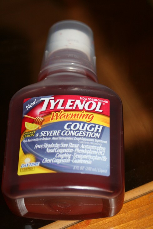
My allergies keep me sick throughout the year. On average, I find myself in the cold medicine isle of the drug store three to four times a year, bleary-eyed and sniffly, trying to find the right medicine. I am immediately assaulted by harsh geometry and cold, unfeeling or just plain cluttered design like this.

I feel terrible, and all I want is to feel better. I want something that is going to feel like a warm bowl of soup, a cozy blanket and my mom stroking my hair. I want something comforting, and cold medicine packaging is anything but. This is the challenge I decided to take on: make cold medicine look as good as it’s going to make the user feel.

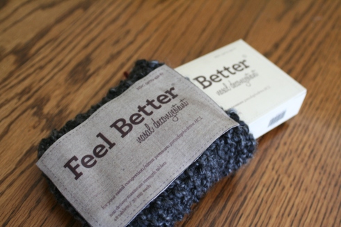
I wanted to create something novel and unexpected. Given the fast approaching deadline, I knew my limitations; I had to go with something I already knew how to do. Thankfully, I learned how to knit in high school, and what’s more comforting than a knit sweater? It was a solid concept; all I had to do was learn to knit pouches and I was set. After some internet research, I quickly learned and applied the technique.

Deciding on the typography was fairly easy, but typesetting the Drug Facts proved to be rather difficult. I wanted the look and feel to be simple, but there is a lot of information that is legally required to be on medicine packaging. But, this is why I love design: there are certain rules and challenges you have to figure out how to work around. All in all, I feel very proud of my work, even though these are all just mock-ups, and I hope to push the concept even further and really develop these into something fantastic.

I love the future!

2 Feb

Okay, if you love watching internet videos as much as I do, you’re going to love this post.

So lately I’ve been mildly obsessed with futurism. Not the Marinetti’s-crazy-manifesto-birthed Italian art movement from the early 20th century. I’m talking about the futurists of today..the scientists, engineers, designers and other brilliant people who imagine and innovate to envision the future of humanity, technology and everything:

Brian David Johnson on being an Intel futurist

The Morrow Project is this incredible book that I haven’t finished reading yet in which four different authors describe a typical day in the typical life of the typical person in the freaking future. Intel has provided the whole book as a free pdf download here. Brian David Johnson is the Head Futurist (I so love that that’s a job) at Intel, and he’s all about using science fiction narratives as a jumping off point to begin the discussion about the actual future.

And this, ladies and gentlemen, is what draws me to futurism today. I don’t care if you’re not a geek, everybody loves a good science fiction story. Everybody wants their own robot butler and flying car. I mean Threadless even sells a shirt about it:

When I was younger, I loved cartoons like every good kid is supposed to. Some of my favorites, though, were “home of tomorrow” themed. I loved them because they seemed at once ridiculous and attainable. Some of you may have seen the 1967 Wink Martindale film, “1999 AD,” as it’s made its rounds on the internet recently. I’ll post for you part two of three (all three parts can be found on YouTube):

1999 AD

This film, produced by Philco-Ford (company acquisitions and nonsense…look it up), is eerily close to predicting the modern conveniences of today. What I find fascinating about this film is that the concepts for these conveniences were there, but they were wrapped in the context of the technology that was available at the time. While seeing a fax machine hailed as the future brings us a laugh, it immediately raises the question: what do we think is awesome now that will look like a pile of dog poop in fifteen years? And what will be the technological advancement that makes it look so? The same questions are raised by this much more recent (1994) excerpt from the Today Show:

What is the internet, anyway?

Hilarious. Also, exciting. Exciting because technology is advancing at exponential speed. Exciting because the future is going to blow everyone’s minds. All your 2012 nonsense aside, imagine how awesome 2030’s going to be. YES, PLEASE.

I love watching people who are thinking about these kinds of things and sharing them with the world. Design thinking combined with technological advancements is going to make the future incredible. But you know, the future we live in now is already pretty incredible. I know a lot of you have seen what Louis C.K. had to say on Conan, but to remind you of how right he was:

Everything’s amazing, and nobody’s happy

So very true. What we have now is indeed amazing. Which makes what the future holds downright mind-blowing. Here are some of my favorite projects I’ve found on the internets:

How can we make mobile communication more emotional?


Electrolux “Heart of the Home”


Microsoft Future Vision Montage


Philips “Daylight Window”


IDEO Future of the Book

The Future of the Book. from IDEO on Vimeo.


The William: The Stove Top of the Future

So there’s a quick glance at what I’ve been doing around the internet lately, and where some of my latest inspiration is coming from. I leave you now with a link to this article from Impact Lab on what the future may very well hold for us.

I wrote a manifesto

25 Jan

Last semester I was asked to write a manifesto. It was possibly my most difficult project to date, but also my most enlightening. By examining deeply and honestly the way I felt about my field, my work and myself, I discovered that I contradict myself over and over, and have trouble speaking in absolutes. I’m generally this way with my philosophy, though. I think the best outlook is a flexible one. That being said, it’s a difficult sensibility to bring into a manifesto. This was a challenge. I decided to play up my contradictions, and write the manifesto with a sense of flexibility and relativity. I am proud of what I came up with, and stand behind it.

Manifesto for the Young Designer in the Real World

Take yourself seriously

Don’t sell yourself short because no one knows or cares who you are. Being a famous designer is like being a famous dentist. No one outside of your field cares. Fame is fleeting anyway, and should never be your goal. If you gain recognition, it will be because you’re talented, work hard, and are a pleasant human being, not because you strived for fame.

Don’t take yourself so seriously

Not every piece of work you create has to be some great commentary on the human condition or ask the viewer to question his reality. Some things are just pretty, and that’s okay. You’re a creative person, and you like seeing pretty things. This doesn’t mean you’re shallow or incapable of deep contemplation about the world around you, it just means you’re human.

Create what makes you happy, not just what’s work

Not all of your work needs to go into your portfolio. Create something small every day that means nothing. Sometimes you will find greatness buried in your scribbles and doodles. Do silly, funny, or just plain awesome projects that bring a smile to your face, and make you remember why you got into this in the first place. Working yourself to death is a great way to lose your passion, and your soul.

Create what’s work, not just what makes you happy

You are trying to make a living out of this, so do work that brings in money, and is portfolio- worthy. It is nice to think that as often as possible, we should do work that accomplishes a goal of social good. However, the world is full of rent checks and electric bills. Occasionally you will find yourself needing to do commercial work to survive. Do not let this make you feel like a sell-out, it is simply the way of the world. Be sure the work you do is never in promotion of harm, and you can always be proud of yourself and your work.

Don’t work for free

Charge for your work. It’s a little scary to ask for money the first few times, but remember: this is your job. If you treat yourself like you don’t deserve the money, no one’s going to give it to you. When you’re young, people think they can take advantage of you, promising that you will get noticed through the work you do for them for free. These “exposure” jobs are crap. No one will ever care who made the logo for their crappy band or small business or whatever. They are taking advantage of you, and you’re better than that.

Work for free

The only jobs worth doing for free are for charity or other non-profit orginazations. They need good design, and you need karma. Just as people donate money, so you can donate your skills and talents in promotion of good. Plus, these pieces make great portfolio/ resume work.

The world is harsh

You will need a thick skin to live here. People will hate both you and your work. Don’t spend too much time thinking about it, you may start to believe them. People will try to scam you out of money. Get everything in writing. Find a professional designer or better yet a lawyer you trust and work out a basic contract. Have everyone you do work for sign it. Hope you rarely have to resort to threatening breach of contract.

The world is beautiful

Life requires a certain amount of cynicism to survive. Do not let yourself become jaded. The world is harsh, but it is also beautiful. Never lose your sense of wonder, for there are still things to discover and explore. Enjoy what you do, and never forget that there are good people in the world, and sometimes they make mistakes. So will you. Be forgiving.

You need people

Nobody can sustain their passion without a community surrounding them, Get involved with the design community, and at the same time make sure you do not wrap yourself in a bubble; make meaningful connections with those outside your field as well. Inspiration can be found everywhere, and you will always learn something new. Allow yourself an active social life. Your work is not the definition of you, but merely an aspect. Having a rich, full life outside of design will aid you in not only in the work you make, but in your own sanity. Do not try to live despite your work; let your life inspire you to work.

You need yourself

You are your most important commodity. Set a daily deadline for yourself. If something doesn’t get done by the end of the day, don’t touch it until tomorrow. Force yourself to find balance. Eat vegetables, drink water, and get plenty of sleep. Stop wearing your 3 hours of sleep as a badge of honor. It doesn’t mean you work hard, it means you don’t know how to manage your time well. Take care of yourself.